
Next availability June 2026
Jumping Pans
Client: The Restaurant Group
Agency: Cheil
Industry: Hospitality and Food Service
Services: 360 Campaign: Logo, Brand, Visual Identity and Advertising
Date: 2021 and 2026 (re-approach/campaign build)
Role: Senior Designer/Designer Lead
Intro
Jumping Pans is a delivery-first Pan-Asian takeaway brand created for The Restaurant Group. Designed to cut through an oversaturated takeaway market, the brand was built around the idea of travelling through taste — combining bold street-food flavours with the energy of Asian nightlife and travel culture.
Brief and Outcome
Working alongside a Creative Director and team, I created and develop the brand from the ground up — from naming and positioning through to visual identity, packaging and campaign direction. The aim was to create a takeaway experience that delivered more than just food, bringing together flavour, movement and discovery to make each order feel like a journey.
2026 Update
Independently expanding the world of Jumping Pans in my own time — pushing the identity into a more campaign-led, culturally relevant and advertising-focused space for the 2026 market.
Final logo
AR Markers

2026 Development
As the foundations is already strong, the marque has personality, the shorthand icon is memorable, and the cyan/magenta palette immediately gives it energy and recognisability in crowded delivery-app environments. What’s missing now is a richer world around the identity: a system that turns the logo into a full cultural and sensory experience.
Guidelines

New KV
Typography: What's changed?
To give the logo greater impact as a standalone mark, Futura was replaced with a new primary and secondary type system. The updated typography brings more personality and flexibility to the brand, balancing cultural energy with a clean, contemporary aesthetic.
Bold condensed grotesks are paired with mono-inspired utility type, inspired by travel documents, receipts and airport coding systems. The result is a typographic system that feels both expressive and functional.

Brand Identity
Photography and art direction became key to elevating the brand. Cinematic food imagery and neon nightlife references created a premium editorial aesthetic inspired by fashion, music and street culture rather than traditional takeaway advertising. The result is a delivery brand that feels immersive, recognisable and culturally relevant.

Photography Style


Branded Elements
The introduction of the travel concept transformed the brand narrative into something more ownable and experiential. Immigration stamps, destination labels, boarding pass-inspired graphics and route-based flavour naming systems create a recognisable world around the food, turning every order into a journey.
Dishes become destinations: from Bangkok Smoke to Tokyo Heat and Seoul Crunch, reinforcing the idea of travelling through taste.

Pattern

Categories


Packaging
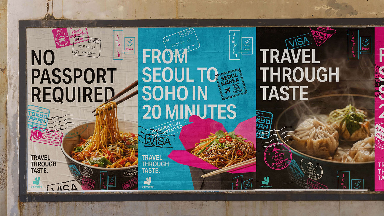

OOH Advertising
Motion

Static
Instagram Stories
Summary
Jumping Pans has evolved from a takeaway brand into a bold cultural experience inspired by nightlife, movement and travel across Asia.
Neon-inspired colour, high-contrast typography and immersive food photography create a visual identity that feels fast, expressive and digitally native—built to thrive across delivery, social, motion and outdoor channels.